Phone Font Review: A Joyful Typeface for Web Design
I was deep into a redesign for a boutique lifestyle coaching website last Tuesday, staring at a hero section that felt technically correct but emotionally flat. The layout was clean, the images were high-resolution, and the color palette was on brand, yet the headline lacked soul. I needed a typeface that could bridge the gap between professional credibility and approachable warmth. That is when I pulled Phone from my library of Script Amp fonts to test in the header.
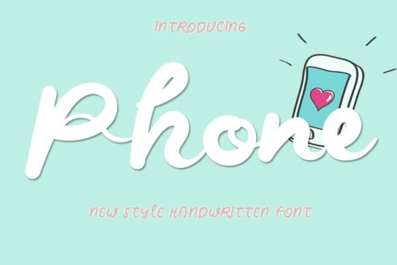
The effect was immediate. Phone is a beautiful and sweet handwritten font that brings a fresh, clean, and elegant energy to digital spaces. It does not scream for attention with chaotic strokes or excessive swashes; instead, it invites the user in with a gentle, joyful presence. As a web designer, I am always cautious about using script or handwritten fonts online because of readability concerns on mobile devices. However, Phone surprised me with its clarity and balance, making it a viable option for modern typography in web design projects that require a human touch.
Bringing Human Warmth to Digital Interfaces
In the world of UI design, we often lean heavily on geometric sans serif fonts to convey stability and tech-forward thinking. While effective, this can sometimes result in a cold, sterile user experience. Phone offers a refreshing alternative for brands that want to emphasize connection, creativity, and care. Its visual personality is defined by smooth, consistent strokes that mimic natural handwriting without the messiness of actual pen-on-paper variability.
When I applied Phone to the main headline of the coaching site, it transformed the tone of the page. The font feels incredibly joyful, adding an layer of emotional appeal that static images alone could not achieve. It works exceptionally well for short phrases, names, and titles where you want to establish an immediate emotional connection with the visitor. For this project, the client’s brand identity was built around empathy and personal growth, and Phone aligned perfectly with that narrative. It signaled to the user that this was a safe, welcoming space before they even read the body copy.
This makes Phone an excellent choice for various digital applications, including:
- Landing page headers for creative portfolios
- Hero sections for boutique online stores
- Call-to-action accents on course sales pages
- Digital ad graphics for social media campaigns
- Blog post titles for lifestyle and wellness niches
- Website banners for seasonal promotions
Readability and Performance in Responsive Layouts
The biggest challenge with any decorative or handwritten font in web design is ensuring it remains legible across different screen sizes. A font that looks stunning on a 27-inch monitor can become an illegible blur on a smartphone. During my testing, I resized the browser window repeatedly to check how Phone behaved in responsive layouts. I was pleased to find that the letterforms maintain their integrity even at smaller scales, provided you manage the sizing correctly.
For optimal readability, I recommend using Phone primarily for display purposes. It shines as a hero title or a section heading where the font size is large enough to appreciate the nuances of the handwritten style. I would advise against using it for body copy, navigation menus, or form labels. The intricate connections between letters, while beautiful, can reduce scanning speed when used in dense paragraphs or small point sizes. In a dashboard interface or a text-heavy article, a clean sans serif font is still the superior choice for accessibility and ease of reading.
When placing Phone over image backgrounds, contrast is key. Because the strokes are relatively uniform in weight, the font can get lost against busy or low-contrast images. I found that it performed best when placed over solid color blocks, subtle gradients, or images with significant negative space. Adding a slight drop shadow or a semi-transparent overlay behind the text can further enhance visibility without detracting from the font’s elegant aesthetic. This attention to detail ensures that the font adds value to the user experience rather than creating friction.
Strategic Font Pairing for Brand Consistency
A standalone font rarely carries a whole brand identity. The magic happens in the pairing. Phone’s fresh and clean nature makes it surprisingly versatile when combined with other typefaces. Its elegance allows it to pair well with both serif and sans serif fonts, depending on the mood you wish to create. For the coaching website, I paired Phone with a minimalist sans serif font for the body text. This combination created a balanced visual hierarchy: the handwritten font drew the eye and set the emotional tone, while the sans serif provided structure and clarity for the informational content.
If you are designing for a more editorial or luxury feel, consider pairing Phone with a classic serif font. This combination evokes a sense of tradition and sophistication, suitable for wedding planners, high-end boutiques, or artisanal product brands. The contrast between the organic flow of the handwritten script and the structured lines of the serif creates a dynamic tension that keeps the design interesting. However, avoid pairing it with another script font, as this can lead to visual clutter and confuse the user about where to focus their attention.
Consistency is crucial in web design. Once you establish a pairing, stick to it throughout the site. Use Phone sparingly for emphasis—such as in pull quotes, testimonial headers, or special announcement banners. This restraint preserves the font’s impact and prevents the design from feeling overly decorated. By treating Phone as a premium accent rather than a workhorse, you elevate the perceived quality of the entire digital experience.
Practical Considerations for Web Implementation
Before integrating Phone into your next web project, there are several technical and licensing factors to consider. First, check the included file formats. For web use, you will need WOFF or WOFF2 files to ensure fast loading times and broad browser compatibility. Slow-loading fonts can negatively impact your site’s performance metrics and user engagement, so optimizing your font assets is essential.
Also, review the commercial font licensing terms carefully. If you are building a site for a client or creating a digital template for sale, you must ensure your license covers web embedding and commercial use. Script Amp typically provides clear licensing options, but it is always wise to double-check before launching a live site. Additionally, explore any included alternates or ligatures. These features can add subtle customization to your headings, allowing you to tweak the flow of specific words to improve spacing and visual balance.
Finally, consider multilingual support if your audience is global. Not all handwritten fonts include extensive character sets for non-Latin scripts. Verify that Phone supports the languages required for your project to maintain brand consistency across different regions. By addressing these practical details upfront, you ensure that the font not only looks beautiful but also functions seamlessly within the technical constraints of modern web design.
Phone is more than just a pretty typeface; it is a strategic design asset that can humanize digital interactions. Whether you are refreshing a personal portfolio, launching a new online store, or designing a landing page for a creative service, this font offers the perfect blend of joy and elegance. When used with intention and paired wisely, it has the power to transform a standard webpage into a memorable brand experience.